
Chapter V:
9 Eye-Catching Color Combinations To Elevate Your Home
Any good designer will tell you, color has power. It can be used to evoke different moods, tell a story within a home, even change the way someone feels in a space. So deciding on the color palette for a room can be high stakes and fairly tricky. Before you begin choosing paint colors, furniture, or decor, it’s important to understand which colors work best together and why.
According to Nicole Gibbons, founder and CEO of Clare Paint, there are several different approaches you can take when it comes to color pairings.
1) Opt for Colors with Like Temperatures:
“Colors can be bucketed into two groups—they’re either warm or cool. And pairing colors with like temperatures always results in harmonious color combinations. For example, pairing cool hues like blues and greens together always works well. Or pairing a mix of warm neutrals, such as a soft beige with a rich brown or a deep shade or orange, will be equally pleasing to the eye.”
2) Go Monochrome:
“I love working with monochromatic palettes. Think tone on tone. It’s a very sophisticated look and is almost foolproof to pull off and make work. Colors within the same hue but slightly different tones—for example, a pale blue with a deeper blue—will always look stunning.”
3) Choose Complementary Colors:
“Opposites attract and this certainly holds true when thinking about color in terms of the color wheel. Colors opposite one another tend to be very complementary and look beautiful when paired together. One of my favorite complementary color combos is pairing shades of coral with blue-green aqua tones.”
And if all else fails, a heavy dose of great inspiration can go a long way. Read below for 9 eye-catching color combinations in some of our favorite spaces.
1. TURQUOISE + CREAM

A living room wall gets a dramatic lift from turquoise grasscloth walls, which serves as a backdrop to a cream console and lampshades.
2. VIRIDIAN GREEN + PURPLE
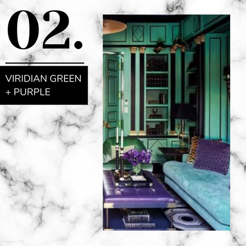
Deep shades of green and purple in a variety of textures conjures feelings of vintage luxury in this office.
3. GREEN + RED

A classic pairing of green and red are elevated with varied patterns and textures.
4. GOLD + ROYAL BLUE
In this posh living room, a sofa in royal blue silk velvet is flanked by custom side tables in a beautiful yellow gold, which are topped with coordinating lamps.
5. ROSEWOOD + MOSSY GREEN

A master bedroom's dressing area channels a Moroccan vibe, where mossy greens and rosewood red are bold but grounded in earthier undertones.
6. BABY BLUE + PEARLY PINK
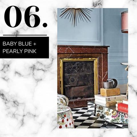
Custom blue paint in this living room serves as the backdrop to a gorgeous mix of patterns and eclectic accents. A pearly pink lampshade balances the cool blue of the walls.
7. CORAL + LILAC

In a cozy master bedroom, a palette of soft pinks and purples including lilac bedding and a coral chair feels comfortable yet elegant.
8. BRICK RED + TAN

Clean, spare, and light-filled, this home office plays off of warm neutrals that are cozy and coordinated.
9. BLUSH + DARK OLIVE

A living room's palette of soft earth tones includes blush and dark olive pillows, bringing color into the space without feeling overly punchy.
With all our love,
Hometecture Team 🤍
Credits: https://www.elledecor.com/design-decorate/color/g26629581/best-color-combinations/